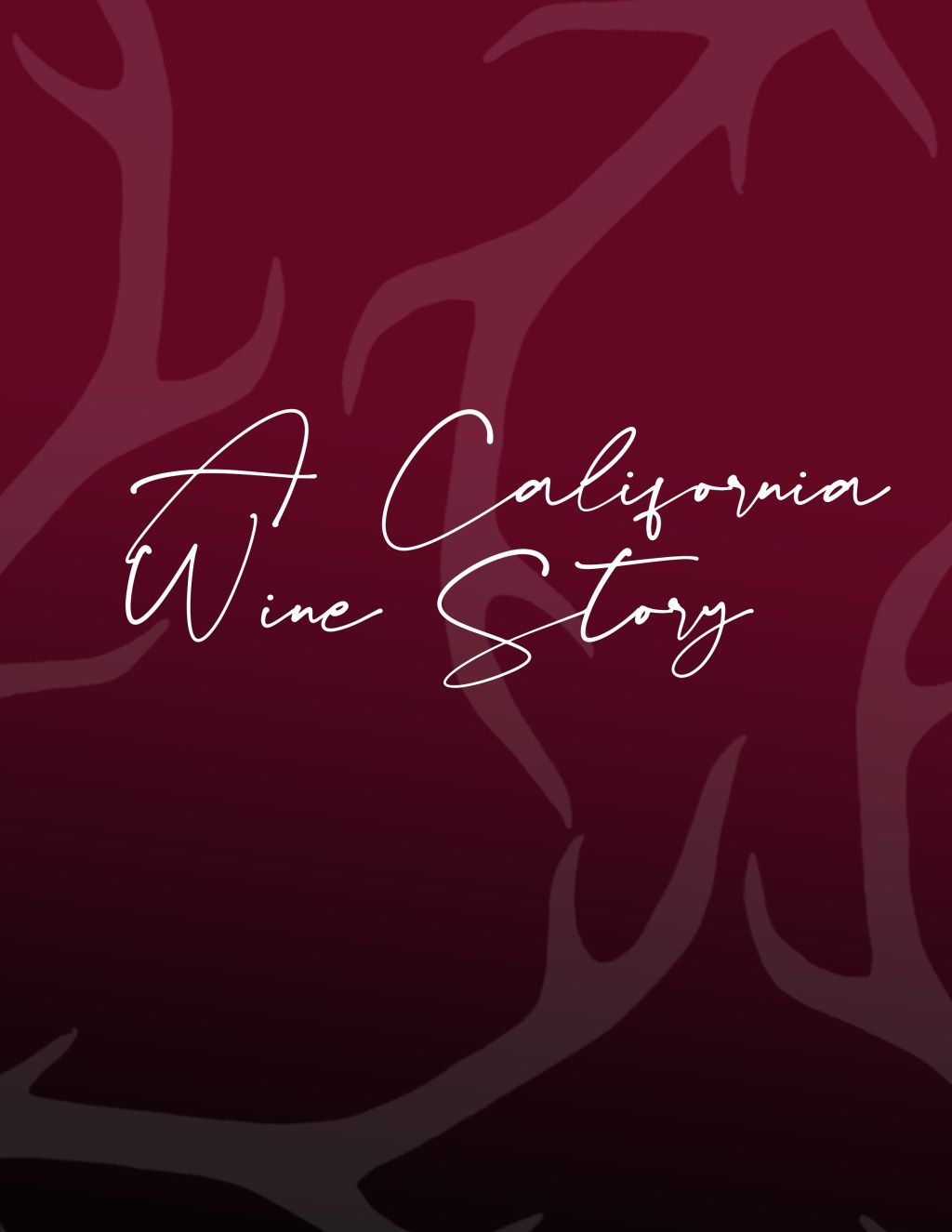
Box inserts for a California winery
This multi brand wine company wanted to create an updated version of their already beautiful box inserts. It was an example of doing work for a brand that already has a great presence. My goal was to do a slight refresh that would add that extra bit of flair to the box upon opening. My flair piece was the brochure booklet with a die-cut. The bottle shaped booklet symbolizes the preliminary notion that you will be receiving many bottles of wine and loving all of them differently.
